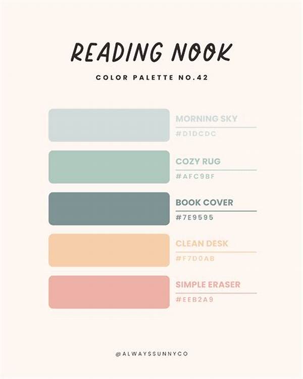
In today’s digitized world, where screens are the gateways to endless information, how we perceive and interact with digital content has become increasingly important. One crucial factor that often gets overlooked is the color scheme used for digital reading. This seemingly simple aspect can significantly influence both the comfort and efficiency of the reading experience. Let’s delve into the nuances of color schemes for digital reading and uncover why it matters so much.
Understanding the Importance of Color Schemes
When it comes to digital reading, the color schemes used can significantly impact how we absorb information. A well-chosen palette not only makes text easier to read but also reduces eye strain, making the experience more enjoyable. For instance, light backgrounds with dark text are often favored for long-form reading as they mimic traditional print. However, for some readers, darker schemes with light text—often referred to as “dark mode”—are less straining in low-light environments. Such color schemes for digital reading are not merely a matter of preference but are pivotal in ensuring accessibility and comfort.
Some color combinations can evoke certain emotions or focus levels. For instance, soft blues are often found to be calming and enhance concentration, while harsh reds or neons might be distracting. When designing a reading app or website, it is essential to test various color schemes for digital reading to find what works best for your specific audience. This not only improves readability but also encourages longer engagement with the content.
The Science Behind Color Perception
Color perception is a scientific realm that greatly influences our day-to-day interactions with digital media. The right color schemes for digital reading can make a significant difference in how we process the information. Human eyes are naturally attuned to specific wavelengths of light. Understanding these can help in choosing colors that minimize fatigue and enhance clarity.
A balanced scheme with appropriate contrasts can make digital reading an effortless experience, while poorly selected colors can lead to visual fatigue. This understanding is particularly crucial for long reading sessions or extensive browsing. Thus, selecting appropriate color schemes for digital reading goes beyond aesthetics; it’s a science aimed at optimizing the user experience.
Designing with Accessibility in Mind
Inclusion is a critical consideration when discussing color schemes for digital reading. Not all users experience colors the same way; individuals with color vision deficiencies may perceive colors differently, impacting their reading experience. Designing with accessibility in mind ensures that content remains readable and engaging for everyone. This involves using color schemes for digital reading that offer good contrast and can be perceived by different types of vision.
Additionally, providing options for users to adjust color schemes according to their needs can enhance accessibility. Whether someone prefers a high-contrast mode or a specific color palette, allowing customization empowers users to create an optimal reading environment tailored to their personal comfort.
Tips for Effective Color Schemes
1. High Contrast: Use contrasting colors to make text stand out. Black on white or vice versa is classic for a reason.
2. Use Calming Tones: Softer tones like pastel blues or greens can facilitate calmness and improve focus.
3. Avoid Clashing Colors: Combinations that clash may be distracting; stick to harmonizing palettes.
4. Dark Mode Options: Include dark mode for nighttime reading to reduce eye strain.
5. Customizable Settings: Allow users to choose color schemes, accommodating personal preferences and needs.
Emotional Impact of Colors
Colors can dramatically influence our emotions and how we engage with digital content. For instance, blues and greens tend to have a calming effect and can make the reading experience more serene. On the other hand, colors like red might convey urgency or excitement but can also be tiring over extended periods. Therefore, thoughtful selection of color schemes for digital reading involves understanding not only aesthetics but also psychological impacts.
Consider also the context in which your content is being consumed. A news app might benefit from being mostly neutral in color to maintain professionalism, while a creative writing platform could afford more expressive and vibrant hues. The goal is to match the color schemes for digital reading to the purpose of the content and the expected emotional response from the audience.
Optimizing User Engagement
Color schemes for digital reading, when chosen thoughtfully, can optimize user engagement by improving readability and reducing visual fatigue. People will likely stay longer on apps or websites with pleasing aesthetics. More than just keeping users comfortable, the right color scheme guides the reader’s attention to highlights or important information without overwhelming the senses.
Moreover, with increasing emphasis on digital detox and screen time management, users are becoming more aware of how digital interfaces impact their well-being. By offering well-designed color schemes for digital reading, content creators and designers can ensure that digital consumption remains a positive and stress-free activity. These strategies lead to better retention of information, increased return visits, and a more loyal audience.
Summary
In the realm of digital content, color schemes for digital reading hold significant sway over user experience. They are not solely visual elements but vital tools that affect readability, comfort, and emotional engagement. Understanding their importance is paramount for anyone involved in designing digital text interfaces. By choosing appropriate color combinations—whether it be a soothing dark palette for nighttime reading or a classic high-contrast for clarity—developers cater to diverse needs and enhance accessibility.
Designers must consider both the aesthetic appeal and the practical functionality of color schemes. This includes accommodating diverse user preferences and potential vision impairments. By integrating thoughtfully selected color schemes for digital reading, content becomes more inclusive, user-friendly, and engaging. Ultimately, the right colors act as silent facilitators, transforming how users interact with and perceive digital worlds.
